Color Gradient
The Free version lets you pick any solid color for the progress bar. Pro unlocks a two-color gradient with adjustable direction and a live preview in the admin — so you can match the bar to your brand palette precisely.
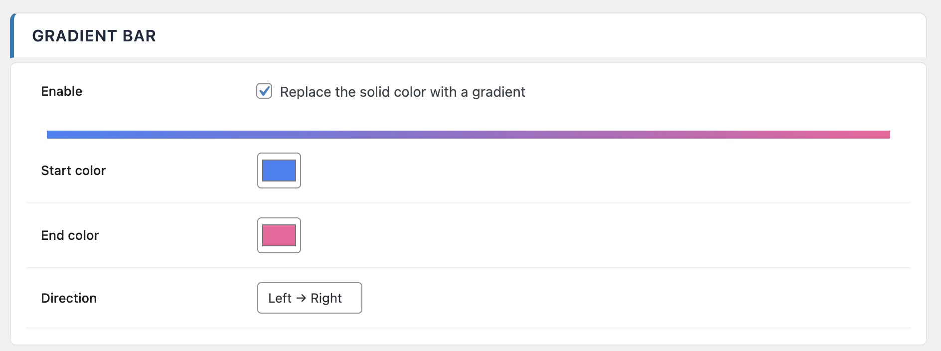
Options
| Option | Values | Default |
|---|---|---|
| Enable gradient | On / Off | Off |
| Start color | Color picker | #3B82F6 |
| End color | Color picker | #8B5CF6 |
| Direction | Left to right / Right to left / Custom angle | LTR |
| Custom angle | 0 – 360 ° | 90 ° |
Direction offers two preset directions and a Custom angle mode for full control. When you pick Custom angle, the direction becomes an absolute angle in degrees (0° points right, 90° points down, 180° points left, 270° points up).
The admin preview updates as you change colors and direction, so you can iterate quickly without saving and reloading a front-end tab.
Per-post overrides
In addition to the global gradient, Pro adds three per-post override fields in the editor sidebar (on top of the standard per-post overrides):
- Color type —
Inherit,SolidorGradient. Lets you force a single post into solid mode even if the global setting is gradient, or the other way around. - Start and end colors — when color type is
Gradient, pick a start and end color specific to this post. - Height — override the global bar height on a per-post basis, useful for distinguishing feature articles from regular content.
These per-post settings inherit from the global configuration until you change them. Reset them to Inherit to fall back to the site-wide values.