Bar Appearance & Display
Every option in this page is available in the Free version. Pro users inherit all of these and add more on top (see the Pro features section of the sidebar).
Accessing settings
All settings live under the Progress Bar menu in your WordPress admin sidebar (top-level menu, not under Settings). Appearance options are grouped in the Style tab.
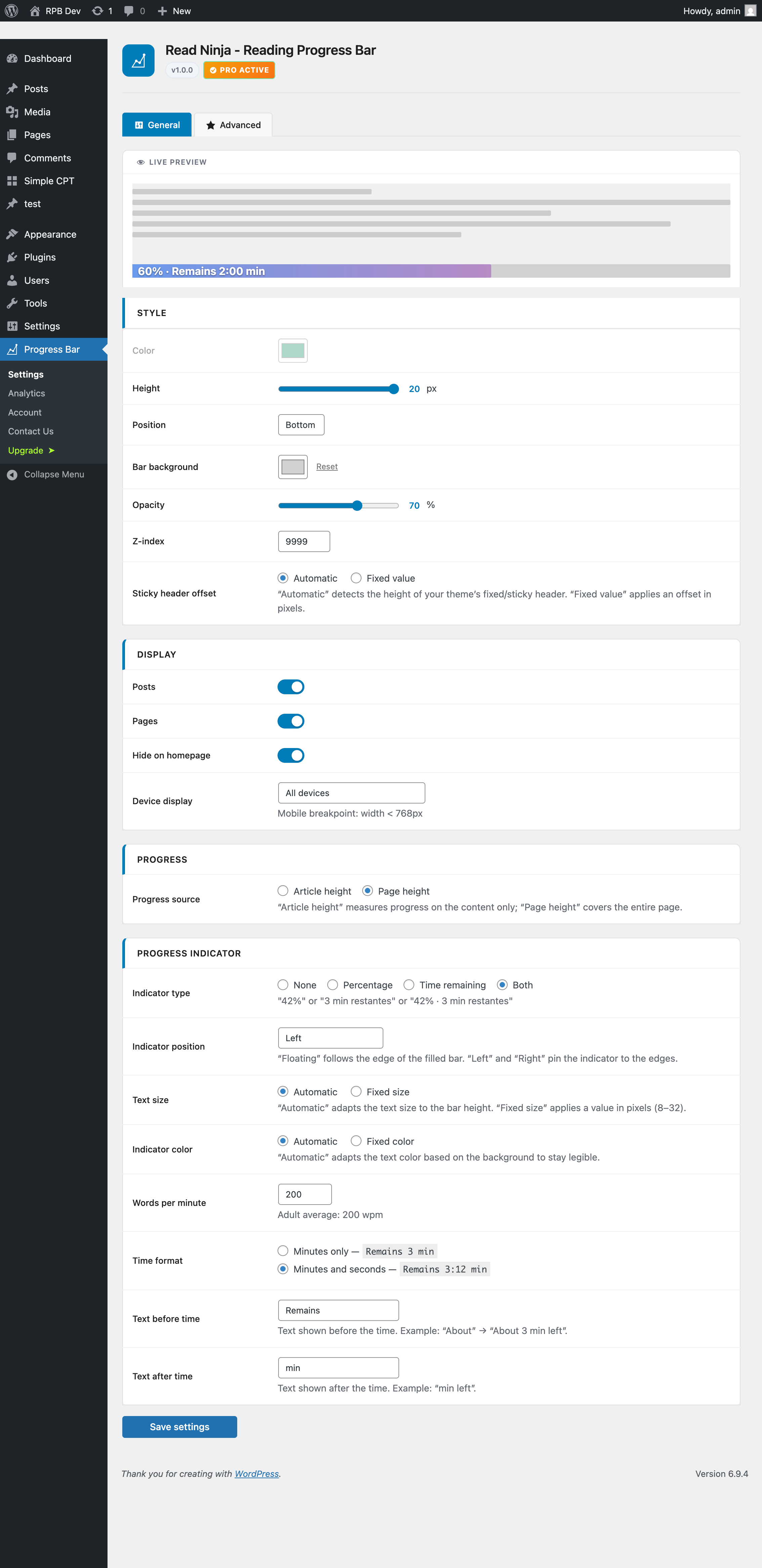
Bar Appearance
Controls the visual look of the progress bar itself.
| Option | Values | Default |
|---|---|---|
| Bar color | Any color (color picker) | #1D9E75 |
| Height | 2 – 20 px | 4 px |
| Position | top / bottom / custom | top |
| Custom CSS selector | Any valid CSS selector | — |
| Track background | Any color (optional) | — |
| Opacity | 10 – 100 % | 100 % |
| Z-index | 1 – 99,999 | 9999 |
| Sticky header offset | auto or 0 – 500 px | auto |
Custom CSS selector lets you anchor the bar to any element on the page — useful if you want it right under a custom header rather than at the viewport edge.
Sticky header offset keeps the bar from disappearing behind sticky headers. The default auto value detects the header height automatically. If detection misbehaves on your theme, set a fixed pixel value instead.
Display Control
Controls where the bar appears across your site.
| Option | Values | Default |
|---|---|---|
| Enable on posts | On / Off | On |
| Enable on pages | On / Off | Off |
| Hide on homepage | On / Off | On |
| Device visibility | All / Desktop only / Mobile only / Hide on mobile | All |
Progress Source
ReadNinja can compute the reading progress in two different ways.
- Content only — the bar starts filling when the reader enters the article body and finishes at the last paragraph. ReadNinja auto-detects common content wrappers like
.entry-content,.post-contentandarticle. - Full page — the bar reflects overall page scroll (from top of the browser window to the bottom of the document).